
Bring productivity in the heart of your activity reports and joy in your clients’ one.
As a service provider it is very likely that you have to regularly write and provide activity reports to your clients. As a client, it is very likely you have to read some.
Reading reports is usually seen as a boring activity. Reports sort of generate boredom by nature. I mean, nobody comes back home after a hard working day like:
— How was your day, sugar?
— Well, it’s gone GREAT! Been reading activity reports from service providers all day long, it was FANTASTIC!
No need to say, providing drugs to your readers so that at the end of the day “It’s FANTASTIC” is definitely not an option.
The use of clear typography and a minimal, one-column layout design ease the report’s ingestion. Yet it’s not going to erase the inherent boredom. So, how can you optimise your readers’ efficiency, give them a quick way to assimilate information and complete consequent required actions?
Let’s find out!
First off, you’d better head to Flyermann’s Vault of Docs and
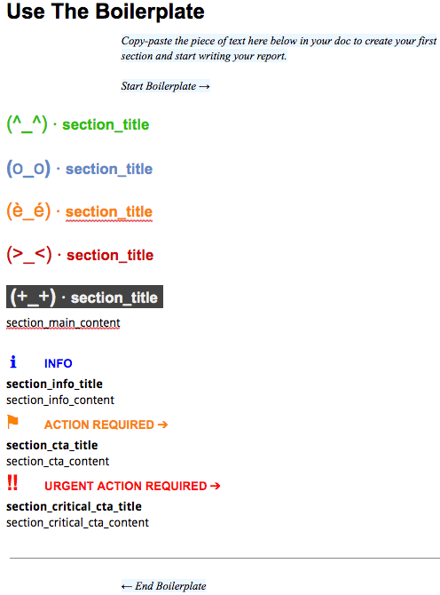
Download Your Report Boilerplate
It’s a 100% free, ready for use template that will allow you to craft reader-centered, highly effective reports!
Your readers will thank you for minimising the impact of your written releases on their own productivity and time. You’ll thank yourself for getting the feedback you require to pursue your tasks, on time.
Of course you may use the system as is — or not, it’s not a universal panacea. It’s your panacea’s foundation. A foundation you’re going to improve to perfectly tailor it to your requirements. First,
Use A Recurring Structure Pattern
throughout the whole report. Even if you choose a storytelling approach when writing reports (yes, you can do that to kill boredom), remember your readers don’t want to be distracted — or even worse, annoyed — by the shape you give to your writing. By structuring your writing with simple repeated patterns, you’ll help them relax and browse it with ease and rapidity.
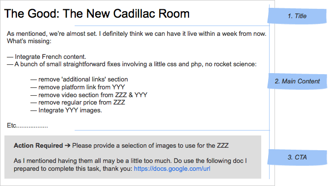
When it comes to Flyermann’s activity reports, I cut them into pieces called sections. Sections are like the atoms of the document. Flyermann’s typical section is made of:
- a Title
- the Main Content
- a Close: it may be just an informative digest or may contain a Call To (Reader’s) Action.
It is of course up to you to add more hierarchy and structure
- into your doc by filing sections into e.g. chapters,
- into your sections by cutting them into more pieces (e.g. splitting their main content in two, like 1. Summary and 2. Body),
As long as you stay consistent and always repeat the same patterns. Now that your structure’s good, let’s
Bring In Signage
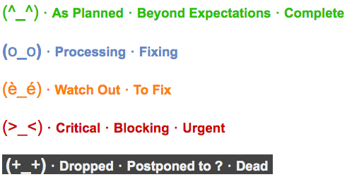
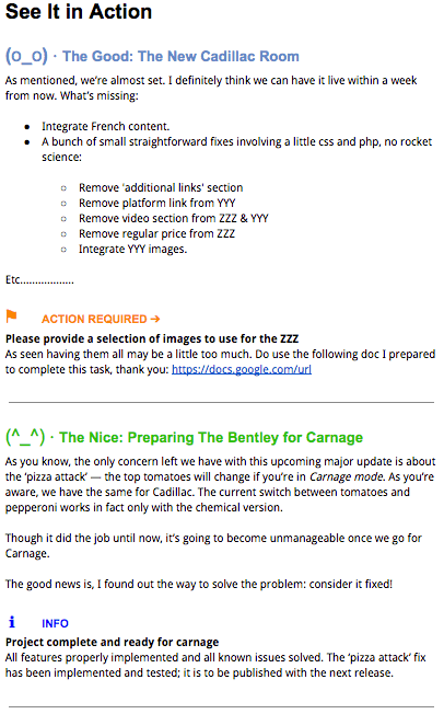
Flyermann’s activity reports use meaningful visual elements — colours and symbols — to provide eye’s guidance and help the reader focus on the right thing. The right thing being the pieces of information that are of primary importance.
Think of it as signage.
My readers know in a snap what’s hot and what’s cool. They have the (illusion of) choice to address what’s hot first — or not — and leave the cool stuff for later — or not.
Colours and symbols also allow to make any required action from the reader stand out, like, “your approval needed on that peculiar one” or “would you please schedule a call on … so that we …?”.
Practically, There are two elements in your document’s sections where you’re going to bring in signage and meaningful colors: the section’s Title and Close.
The Title’s visual aspect depends on the status of the project / task / user story the section is about:
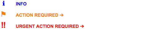
The Close’s display depends
- whether the section’s ending is just informative or requires an action from the reader,
- on the urgency and criticality of the required action.
It’s that simple and minimal. Try it out, squeeze it or stretch it to fit your needs while keeping its straightforward simplicity. And by the way, do not use animated GIFs in your activity reports.
Download Your Free Boilerplate
Be seeing you!
Retour de ping : Linkedin, Drugs & A/B Testing | Flyermann Design & Business Consulting
Les commentaires sont fermés.